
When it comes to computer use, multitasking refers to the ability to run multiple applications at the same time and easily switch among them. Users often engage in multitasking when they perform complex tasks that require putting together multiple sources of information. In fact, collecting, comparing, and choosing between multiple items are the most mission-critical tasks people do with information technology: looking at a single piece of information can be fun or maybe even enlightening, but choosing the best among several options can save a life, earn you a bonus, or at least give maximum enjoyment of an evening at the movies.
When using a large monitor, users will often have two applications side by side and switch attention from one to the other, or even move information from one to another. For instance, in one window, the user may work on a text document, while the other may contain an article used as a reference.
How about mobile devices? While modern mobile operating systems do support multiple apps running simultaneously, few actually allow users to see two (or more) app windows at the same time. With this single-window constraint, tasks such as checking the calendar and writing an email to schedule a meeting become tedious because users must move back and forth between apps. To transfer information from one app to another, users must recourse either to copy-and-paste or to storing that information into their working memory and thus increasing their cognitive load. (This is yet another example of the limitations imposed by a narrow communication human–device communication channel.)
Some mobile designers have toyed with the idea of a split screen. Many Samsung devices have a multitasking mode that lets users see two applications at the same time. And in Windows 8 for tablets it is possible to display applications side by side. However, I haven’t seen many Samsung or Windows 8 tablet users taking advantage of this feature in our user research, for a simple reason: it makes an already small screen even smaller and forces users to work in an even tinier window.


In spite of the modern trend towards larger-screen phones, what makes mobile phones so convenient and portable is their small size. But small size means less room to display content. On a mobile screen users have to interact more with the interface (for example, by scrolling more) in order to get the same amount of content as on a large monitor, and also they have to recall more information to get the same level of understanding because they cannot easily refer to text that they scanned before, but that they need to revisit. In fact comprehension on mobile is twice as bad as on desktop. So the smaller the effective screen space, the poorer the experience.
Facilitating Switching Among Tasks
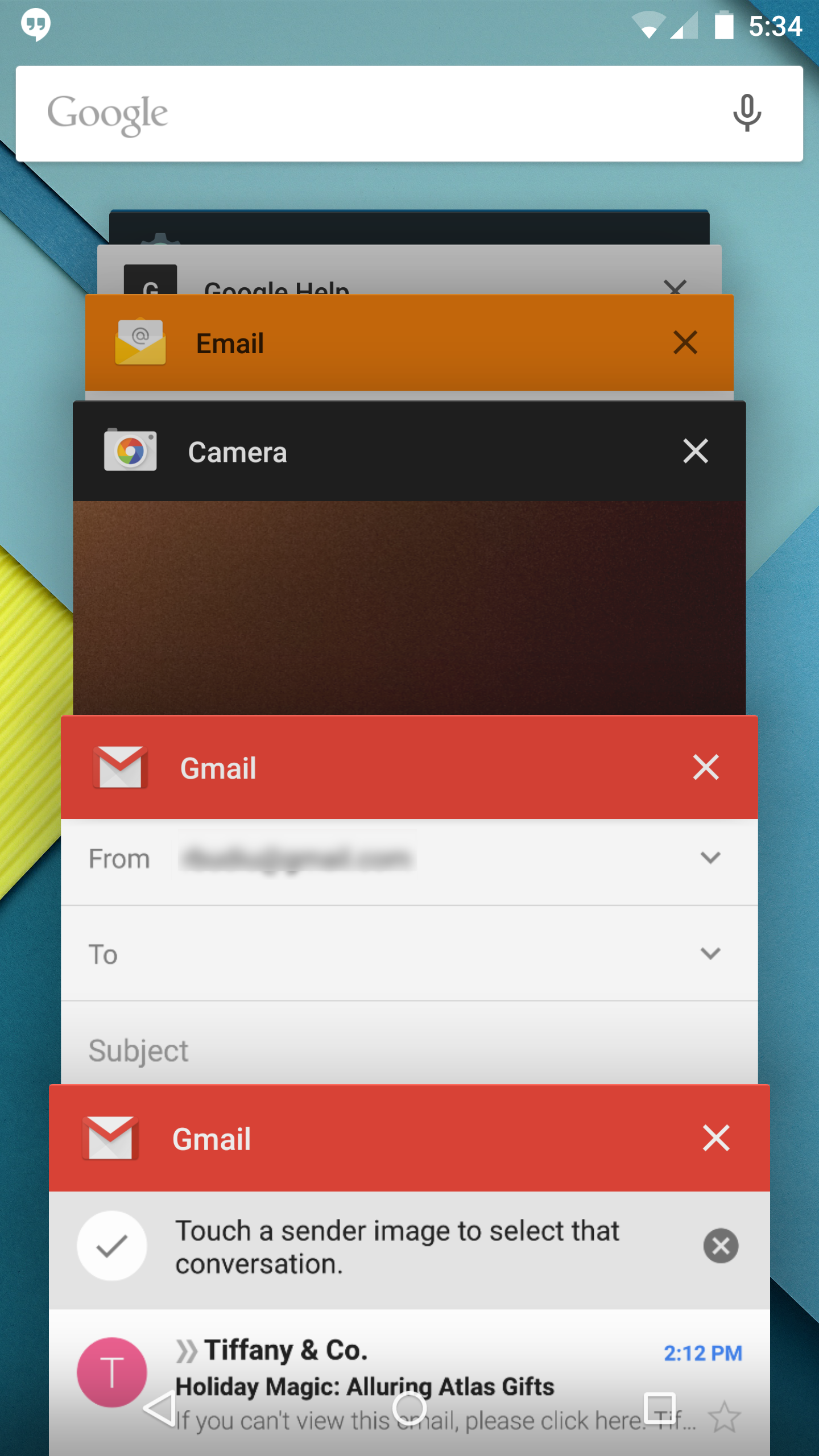
The poor man’s support for multitasking is to facilitate switching between apps, if not side-by-side display of multiple apps. iOS uses two presses on the Home button to allow users to see a carousel of running apps. Provided that there are not too many apps running at the same time, users can switch relatively fast to the one they are interested in.

Until Lollipop, the most recent version of Android, Android devices also had a Recent Apps button that displayed a list of running apps. The Android design was somewhat more efficient than the iOS one because it displayed up to four different items visible on the screen at the same time, so the expected cost of getting to the desired app was somewhat smaller.

In Lollipop, the list has been replaced with a deck of cards stacked one on top of the other. The deck of cards is displayed using a fisheye-visualization technique: items that were used more recently are displayed in more detail than apps that were accessed long ago. (See our HCI course for more on fisheye visualizations.) That enables the screen to accommodate more apps at the same time.
Additionally, Lollipop has added a new spin to the idea of a task list: designers noticed that, in the same way in which you might have multiple tabs in a browser, you may want to access multiple views in an app. For instance, you may be messaging two different people at the same time and may want to quickly access the pages corresponding to each of them. Both these views would have separate thumbnails in the Recent-Apps list.
This approach to multitasking does not solve the problem of combining multiple sources of information, but instead it solves the problem of saving state: If you want to do two different things in your app you won’t have to dig through the interface and recover context to move from one task to another. Instead, you get “frozen” views of each task and with a couple of button presses, you can access the other view.
This new design is definitely a plus as it skips steps and significantly decreases at least some of the interaction cost. But you’d still have to find the right view in a potentially large deck; plus, the number of cards in the deck may increase substantially if each app is allowed to save multiple views. (The card deck is essentially a carousel, and carousels require sequential access instead of direct access.) And, remember, the card view doesn’t really help users put together the information dissipated across multiple sources, so people would still have to carry all that in their working memory.
Do People Need Multitasking on Mobile?
Advanced multitasking on mobile is a chicken-and-egg problem: people don’t ask for it because they don’t do many complex tasks that require multiple sources of information on small screens. But on the other hand you can argue that they don’t do these types of tasks because the current phones do not support multitasking well.
We challenge designers as follows:
- Platform designers (Apple, Google, Microsoft, Samsung, etc.) should invent new ways for more rapid switching between task states, maybe with particularly fast back-and-forth alternation between two applications, with calendar and email being the prototypical example.
- Application and website designers (most of you) should remember that people often need to work on more than one thing, and that comparing and choosing between alternatives has been a prevalent use of the web for the past 15 years. They should thus provide strong support for comparing items and for switching between recently viewed items.
If we can do these things better, we’ll surely see users engage in more multitasking on mobile devices, just as they already do with desktop computers. One thing is certain: multitasking is needed for many of the highest-value use cases, so supporting it better will drive more valuable use of your products, apps, and sites.


