
In mobile designs the hamburger menu or three-line icon is a popular tool to address the concern that on a small screen, space for navigation is limited. Placing the navigation behind a menu is a way to keep it available, but out of the way, giving users access to navigation when they need it.
However, the reason the hamburger menu is useful is also the reason it can be harmful to a website’s business goals. When navigation is visible on a page, it is consistently available, giving users not only quick access to the navigation, but also a way to get an at-a-glance overview of what the site has to offer. When that same navigation is hidden behind a hamburger menu or even a Menu label in a mobile design, there is a higher interaction cost to get the same information – the user has to think about navigation, then locate and expose it in order to view it. If a user cannot or does not locate or expose the navigation, interaction on the site becomes limited. The use of a hamburger menu can reduce the likelihood of users moving around the site.

Not every site is able to limit navigational categories to a number that is easily displayed in a visible navigation bar on a mobile device. This means many designs are drawn to using the hamburger menu, despite its potential drawbacks. So what can a site do to help alleviate the potentially negative effect of using a hamburger menu?
One way to minimize the impact of hidden navigation is to make key user tasks easy to do in the absence of navigation. Imagine a user comes to your site and never finds or uses the primary navigation. How many of your site’s key tasks could still be accomplished?
On the Homepage
A homepage, of course, should reflect the key content and functionality of the site. This lets users know they’ve reached the right page as well as informs visitors what the site (or corresponding organization) does.
Sites can provide links directly to the primary tasks that users come to the site to complete, allowing quick navigation to those key tasks. Quick access to these tasks does not mean simply listing all the navigational links on the homepage. Mobile homepages can support key tasks by providing direct access to these tasks via links and content that drive users to appropriate important areas.

Displaying content or stories from different content areas of the site can also give users quick access to different sections of the site without accessing navigation.

On Interior Pages
Interior pages can provide navigation other than the main hamburger navigation as well, leading users to additional or related resources or other important areas of content.
In-line links, or links that appear within text, can move users to supporting or related information. Lists of related links within or adjacent to content can also aid navigation without users needing to access the hamburger menu. Such links can also direct users to other types of content, such as associated slideshows, video clips, or blogs.


Another approach is the inclusion of a highly visible search. If the search tool is strong enough, presenting it prominently in the design allows users to use it as an alternative to navigation. (Though search can’t be the only solution to users’ content discovery problem.)

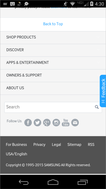
Bottom of the Page
If all else fails, links in or near the footer can give immediate access to key content to those users who scroll to the bottom of the page. Repeating the main site navigation in the footer allows users who reach the bottom of the page to have quick access to navigation, but also exposes the site navigation to those who don't explore the hamburger menu.

Supporting Navigation
None of these methods are unique to mobile design or new to website design. In fact, many simply support how users often navigate content and functionality. However, in the realm of mobile designs that hide navigational options behind a hamburger menu, they also act to support users who may not locate or use the primary method of navigating the site.