Day 100: Tumblr’s Inactive Account Notification
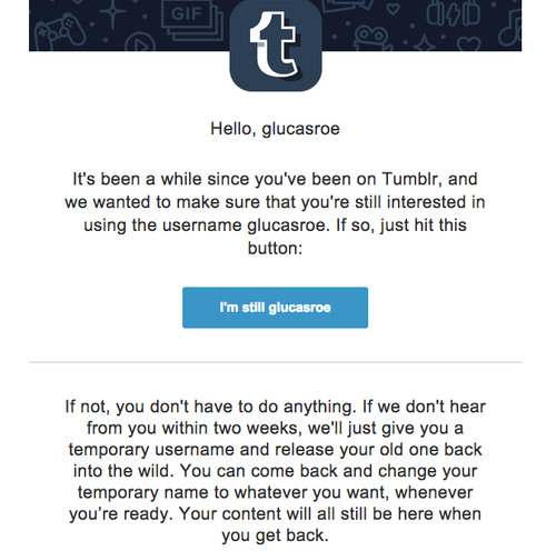
What it is: When your Tumblr account goes inactive, they send you an email asking if you’d like to keep your username.
Why it’s good: I figured that since I started this blog with talking about Tumblr, I might as well end it that way as well (And since this account will be going inactive, it just seemed so perfect)
First, note the conversational tone. Tumblr isn’t begging to have you back (Which some companies do, and it’s just straight up weird.) It very clearly tells you that your content isn’t disappearing, you’ll just lose rights to your amazing and unique username.
The business decision behind this is so amazing that I want to shake someone’s hand for it. This is such a great way to handle the scourge of inactive accounts—allowing new users to grab names without invoking paranoia in the less active.
After you hit the “I’m still me” button, it requires you to reset your password. Not only is this good for security, it also is a pretty intelligent guess that you won’t remember your password if you haven’t signed in for months. It gives a small barrier to cross too, so it isn’t trivial to squat on a ton of usernames.
That’s the last one, folks. Thanks for coming along for the ride.