When the average person visits any website, there's a good chance that they're accessing it from their mobile device. Across every industry, whether customers are searching for a product and making a purchase on their phone, or when prospects are filling out a "contact us" form from their tablet, a great user experience with ease of use is what helps facilitate the successful completion of these actions.
According to a recent eMarketer study, there will be an anticipated 215.8 million mobile search users in the United States by 2019. If you compare those statistics to that of 2014 when there were about 133.6 million users, growth is projected to almost double within a few years. In order to effectively reach what is most likely the majority of your audience and to accommodate that actively growing population, a mobile-optimized website that keeps usability top of mind is an absolute must for all businesses. This allows you to foster engagement with your visitors, generate more conversions, and boost overall performance on all aspects of your site. To produce the best results for your brand and provide your users with a website that is easy to navigate and interact with while they're on-the-go, consider answering these questions before you launch your mobile site:
Is There A Simple Navigation?
Your navigation should be focused on simplicity. In the top left or in the top right, use a "hamburger menu" to house links to important pages. In terms of usability, these three-line icons are one of the best things you can do to indicate where your users should go to explore additional aspects of your website aside from the homepage. The clean design of this symbol doesn't take up much space, and is found on nearly every mobile site, making it a familiar icon that many customers actively look for. 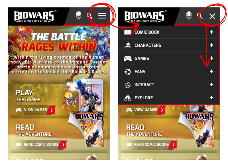
The links to alternate pages that appear when users click on the icon should be easy to use on a touch-screen device, and be optimized for views on a screen that is substantially smaller than a desktop. As always, take the time to test your mobile website using a quality assurance team to make sure that performance is ideal with these buttons across all devices and platforms that your visitors may be using.
Is The Phone Number Easy To Access?
Users are on-the-go and want easy access to your phone number so that they can connect to your business instantaneously when they're using their mobile device. The ultimate solution for this is a click-to-call-button with your number so that when visitors are on your site, they can seamlessly be connected to your customer service department or a representative from your company with a single tap on their phone.
This type of button allows customers to call you directly without much effort at all, and making this step as easy as possible for your potential customers is critical because it's often the first interaction they have with your brand. Avoid using a JPEG that lists your phone number but doesn't provide click-to-call access. Not only is this frustrating from a user perspective, but it presents a barrier to entry when it comes to moving through the conversion funnel and engaging with your brand.
Is Messaging Readable and Concise?
On desktop, the way text appears can look incredibly different than how it would on any mobile device. Never use small text that requires the reader to strain their eyes, because if they are having any trouble reading the text, they simply won't finish reading it and will move on to something else. Within moments you'll lose the opportunity to show them your brand's value.

Be concise and to the point with your messaging. Especially on a mobile device when readers aren't sitting at their desk, they don't have the time to read a lot of copy. Use bold or italic text to put emphasis on important keywords or phrases. Don't be afraid to use imagery - as users, we like visuals. Integrate high-quality, vivid images throughout the copy on your mobile website as a way to supplement text and support the messaging you're displaying. If you're using the right images, sometimes they'll speak louder than words.
Are CTAs Designed with Mobile in Mind?
What's the goal of your website? What do you want visitors to accomplish? Depending on your industry it may be requesting a quote, making an appointment, or checking out. More likely than not, these objectives are how you measure conversions as well. Calls-to-action (CTAs) must be bold and prominent on your site so that the user can find them when they're visiting your homepage from a relatively small device.
Specifically with mobile devices, it's important that you think about how the user is clicking on these buttons, using a thumb as opposed to a mouse. Once the user clicks on the CTA, the fields that appear should be the ideal size and be large enough that typing into them on a smartphone is easy to do without zooming in or out, or excessively scrolling up and down.
Usability and Results
Consider the elements discussed above as a basic checklist to foster a great user-experience for customers on mobile devices. The overarching idea to keep in mind when you're launching a mobile website is to focus on usability for your audience. In the past, desktops were the central focus for website designs, but now, with mobile playing a major role in accessing the internet, you need to have a mobile-friendly website to be successful. By keeping the user top of mind as you design and develop each aspect of your mobile website, your site performance, levels of engagement, conversion rates, and sales will all benefit.