We all have visited cultural attractions, whether it’s the Louvre in Paris or a botanical garden down the road. But you may not be aware that cultural attractions and public venues have been evaluating the experiences they provide for visitors. The unique approach to experience design these attractions are taking can enrich your thinking about UX design.
In the cultural attractions sector—museums, parks, zoos, gardens, and libraries—UX principles are slowly being adopted and applied. Managers of these attractions are unlikely to follow UX literature, have much less money than for-profit entities, and generally haven’t been run using customer-focused business models. But this is rapidly changing with the economic downturn. As funding sources have dried up, cultural attractions have to bring in new revenue by getting creative about inducing visitors to return and spend more money. Cultural attractions have extremely tight budgets—sometimes only in the hundreds of dollars—to spend on improving experiences above and beyond their core missions.
Public gardens can benefit from UX design just as much digital systems or other types of public spaces. Perhaps because gardens are primarily outdoor experiences, or because they are less likely to incorporate technology than other types of museums, they have been less likely to adopt UX design practices.
Descanso Gardens is nestled in the foothills above Los Angeles at the edge of the Angeles National Forest. Descanso was gearing up for a special event that was to take place in their peak visitation season, Spring 2007. The event was projected to more than double their attendance during this already busy time, and Descanso staff members were excited at the opportunity to bring more people to the garden through this special event, many of whom were unlikely to have visited before. The staff members wanted to make sure that the experience was an excellent one—one that new visitors would want to repeat. They also wanted to ensure that regular visitors and members had a good experience so as not to hurt existing business.
Descanso’s concern was focused on their entry and ticketing windows. They had approached several Los Angeles architecture firms and were told that it was a minimum of $10,000 to redo their entry, which was far outside their budget. They were familiar with my work through my book and conference presentations, so they contacted me hoping I could suggest some less expensive changes and improvements.
Tip 1: See the big picture. As with any UX project, the practitioner’s role is to think through the experience from the customer’s perspective to determine realistic solutions that will make that experience flow smoothly and logically. By taking a broader view of the entry experience and how visitors might use it, we were able to greatly improve their entry with low-cost solutions. The engagement also provided positive spillover effect into other areas of visitor services, like the Garden Shop. This scenario can also apply to other venues such as restaurants hosting a festival, retail stores at peak shopping times, and office buildings holding special events in their foyers.
Descanso was focused on improving the ticketing windows, but the visitor experience starts long before that. I always look at the holistic visitor experience, ideally starting from the visitor’s home (where they use the organization’s website), to the transit approach, to the parking or walking entry, and so on. To avoid the expense of two site visits, I gave Descanso instructions on how to photograph the site for my analysis, noting on their map where they had shot the photographs. Easy, inexpensive site surveys can also be done using simple cell phone video, too.
When analyzing site photographs and videos, I look for many things:
- What is my overall impression if I haven’t been there before?
- Are signs placed in the best possible locations?
- Does plant material obstruct any signs?
- What kind of message am I getting about this experience and this brand from the beginning?
- Am I being clearly led from Point A to Point B?
- Are they building anticipation in me as a visitor as I approach?
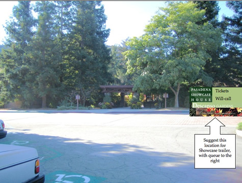
Analyzing the photographs from Descanso highlighted three problem areas:
- A lack of welcome or orientation to the parking area overall.
- Difficulty finding the entrance from the parking lot.
- The proposed location of the ticketing trailer for this upcoming special event.
Descanso wasn’t even aware of the first two issues. This is the norm for this type of project; it’s almost impossible to see your workplace with the fresh eyes of a first-time visitor or customer. Part of the role of a UX practitioner is to bring that fresh, objective perspective.
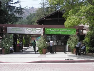
We addressed the issues with colorful vinyl banners, tree trimming, and placing the ticketing trailer in a different location.
The initial plan was to situate the temporary ticketing trailer to the left of the entry area, which would mean ticket buyers would be obstructing the garden’s exit path. This cross-traffic situation would have been extremely problematic, so I suggested the trailer be moved to the right of the entry building, with the queue off to the far right. This would allow cars to drop off people and put them directly into this line without impacting the membership or regular ticket lines. When planning queue lines, it’s important to think about how customers will locate the correct line, where they will stand, and how the queue might impact other traffic.
Tip 2: Dig deeper. I asked Descanso to send me attendance numbers for the previous several years for this time period so I could see how many members and regular visitors they typically had during this season, who would need to be accommodated along with the special event guests. While Descanso had the data available, it hadn’t occurred to them to use it in this analysis. The simple solution—bright banners hanging over each entry lane—worked beautifully and was highly cost-effective.
Before coming to the site I prepared a short PowerPoint presentation, overlaying mockups of my suggestions on Descanso’s photos. This might be obvious to designers, but non-designers often have a very difficult time visualizing solutions. Even simple mockups help people see how the solution will benefit them. It’s always best to provide figures for scale in proposed layouts and show signage mockups overlaid on photos of the site.

As we began walking the entry corridor, another issue became apparent. Descanso asked for my input on the gift shop, which is always an important revenue source for nonprofit cultural attractions. They wanted suggestions on how to increase traffic to the store. One permanent issue for the store is its location on the right side of the entry lane, meaning that visitors have to cross incoming foot traffic to get to the shop as they are leaving Descanso. Visitors don’t want to shop as soon as they’ve bought tickets, they want to shop at the end of their visit.
The right-hand bias—people tending to turn and reach to the right—is well documented in design literature, but seems to be frequently overlooked when sites and buildings are designed. It wasn’t possible to move the gift shop to account for the right-hand bias, but we were able to make it more attractive so people would cross left to reach it. A large, raised planter bed in front of the store took attention away from the store entrance on the side, and also created a problem with traffic flow as visitors tended to sit on the front of the planter. (As an aside, there is never enough seating in public spaces, so visitors will sit on anything they can.) In brainstorming ideas, someone suggested that we simply take out the planter altogether.
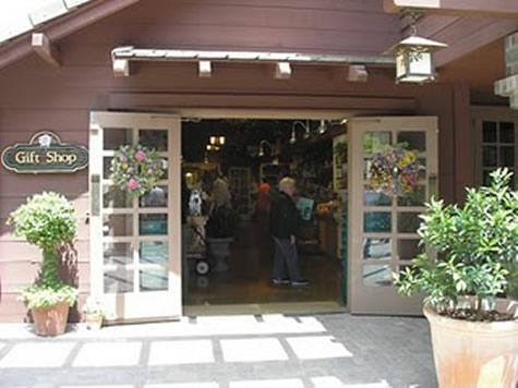
Tips 3 & 4: Leverage in-house assets; ask if something can be moved. While they had very limited funds to spend, they had the labor and equipment on site to make this possible. We also discussed the possibility of moving the store’s entry door from the side of the building to the front. While this would remove some cabinet and display space inside, it was definitely a better option. It would not only visually open up the store to visitors, but would allow them to display merchandise out in front of the shop in a way hadn’t been possible.
Results
Using UX principles and spending only about a tenth of what an architect would have charged, we greatly improved Descanso Gardens’ entry, ticketing area, and store, and made a high-profile special event run smoothly. Conducting experience reviews can empower staff to take on problems and begin to look at more aspects of their operation from a visitor or customer perspective. Applying UX design principles to this problem had positive spillover into other areas of their operation; not only did Descanso remove the planter in front of the store, they also moved the store entry door to the front and have reported an increase in sales. They got so excited about rethinking the garden entry that they relocated the garden’s exit entirely, thereby opening up the entry space wholly to incoming traffic. All in all, they were thrilled with the results of the changes for this special event, and leveraged the opportunity to make permanent positive changes in their visitor experience.
Takeaway Tips
- While the client does define the problem, it’s up to the UX specialist to see the bigger picture. You can fix the defined problem but not address something that’s a bigger issue than the client realizes. It’s up to you to show them solutions that will benefit them the most in the long run.
- Ask deeper questions, always thinking about how customers or visitors are going to use the space, product, or function. Your solution has to work with all the different users, not just the one audience segment that might be defined in the project scope. If they have user data, apply it to inform your solution.
- Utilize all the resources the client has available to them. Figure out how to leverage in-house talent or equipment to help make the most impact.
- If something isn’t set in concrete (or even if it literally is), ask if it can be moved or changed. Sometimes the answer will be “yes,” and that will lead to a better solution.
- While you’re there, teach staff how to think about UX so they have an even greater benefit after your project is over. This leads to referrals and return engagements.


